How to measure Core Web Vitals in Google Data Studio with CrUX

The Core Web Vitals update is upon us and it is worth taking a look at how we as SEOs can be best prepared for their impact. Not only should we be fully aware of what it is but also what tools are available to us to report accurately and infer meaningful insights to recommend to our clients for a better user experience.
In order to do so, one of the most beneficial tools is the Chrome User Experience report, or more casually known as CrUX for short. CrUX is a public dataset collected from over four million websites, by Google, from actual real user experiences, known as field data. Field data is considered more reliable and a better representation of your site’s performance in contrast to lab data.
The data is stored in BigQuery, Google’s online data storage warehouse and can be retrieved using SQL queries.
Not only does the CrUX dataset report on the three Core Web Vitals, Largest Contentful Paint (LCP), First Input Delay (FID) and Cumulative Layout Shift (CLS), but also on diagnostic metrics such as the First Contentful Paint (FCP) and Time to First Byte (TTFB), as well as user demographic dimensions like device distribution and connectivity distribution.
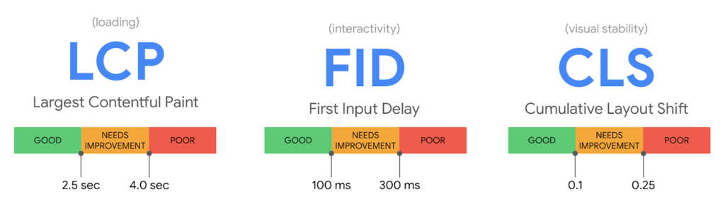 Image credit: web.dev
This public data set of real user experiences can be accessed through tools that you might already be familiar with, such as Google’s PageSpeed Insights which uses both field data and lab data to report on Core Web Vitals at both an origin and individual page level, for the most recent aggregation of 28 days.
You can also connect to the CrUX dataset through BigQuery itself, giving you access to the raw data that is stored online and create your own custom reports. This however would require an understanding of SQL, which not all SEOs have.
Finally, there is the CrUX dashboard, which you may not be as aware of, which is a dashboard visualised in Google Data Studio. While both Google PageSpeed Insights and BigQuery have their advantages for reporting on Core Web Vitals, the CrUX dashboard stands out from the rest for a range of benefits including its ease of set up, use. the clarity in which it presents the breakdown of data and the inclusion of additional diagnostic metrics as well as user demographics.
But, most importantly, the historical data it possesses month over month allows for us to track and determine how our data is trending, and the impact of our SEO recommendations.
It’s for these reasons the CrUX dashboard should be an indispensable asset to every SEOs toolkit and a welcomed addition to your client reporting.
Here is a breakdown of the CrUX dashboard and some of the benefits it provides.
Image credit: web.dev
This public data set of real user experiences can be accessed through tools that you might already be familiar with, such as Google’s PageSpeed Insights which uses both field data and lab data to report on Core Web Vitals at both an origin and individual page level, for the most recent aggregation of 28 days.
You can also connect to the CrUX dataset through BigQuery itself, giving you access to the raw data that is stored online and create your own custom reports. This however would require an understanding of SQL, which not all SEOs have.
Finally, there is the CrUX dashboard, which you may not be as aware of, which is a dashboard visualised in Google Data Studio. While both Google PageSpeed Insights and BigQuery have their advantages for reporting on Core Web Vitals, the CrUX dashboard stands out from the rest for a range of benefits including its ease of set up, use. the clarity in which it presents the breakdown of data and the inclusion of additional diagnostic metrics as well as user demographics.
But, most importantly, the historical data it possesses month over month allows for us to track and determine how our data is trending, and the impact of our SEO recommendations.
It’s for these reasons the CrUX dashboard should be an indispensable asset to every SEOs toolkit and a welcomed addition to your client reporting.
Here is a breakdown of the CrUX dashboard and some of the benefits it provides.
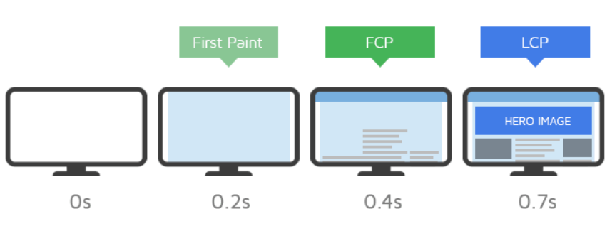 Image credit: gtmetrix.com
Second is the First Input Delay Core Web Vital, or FID. This web vital measures the time between when a user interacts with your site, to the time the page is able to respond to that interaction. Examples of this can include when a user simply clicks on a link or a button. The optimum measurement for FID is less than 100 milliseconds to achieve a good experience.
Finally, the last Core Web Vital is the Cumulative Layout Shift, or CLS. This metric measures how often a user experiences an unexpected change or movement in the visual layout of a page. An example of this can be when a user is about to click on a link and suddenly the link moves out of place, or if you are reading an article, the text might unexpectedly shift to a different direction.
Image credit: gtmetrix.com
Second is the First Input Delay Core Web Vital, or FID. This web vital measures the time between when a user interacts with your site, to the time the page is able to respond to that interaction. Examples of this can include when a user simply clicks on a link or a button. The optimum measurement for FID is less than 100 milliseconds to achieve a good experience.
Finally, the last Core Web Vital is the Cumulative Layout Shift, or CLS. This metric measures how often a user experiences an unexpected change or movement in the visual layout of a page. An example of this can be when a user is about to click on a link and suddenly the link moves out of place, or if you are reading an article, the text might unexpectedly shift to a different direction.
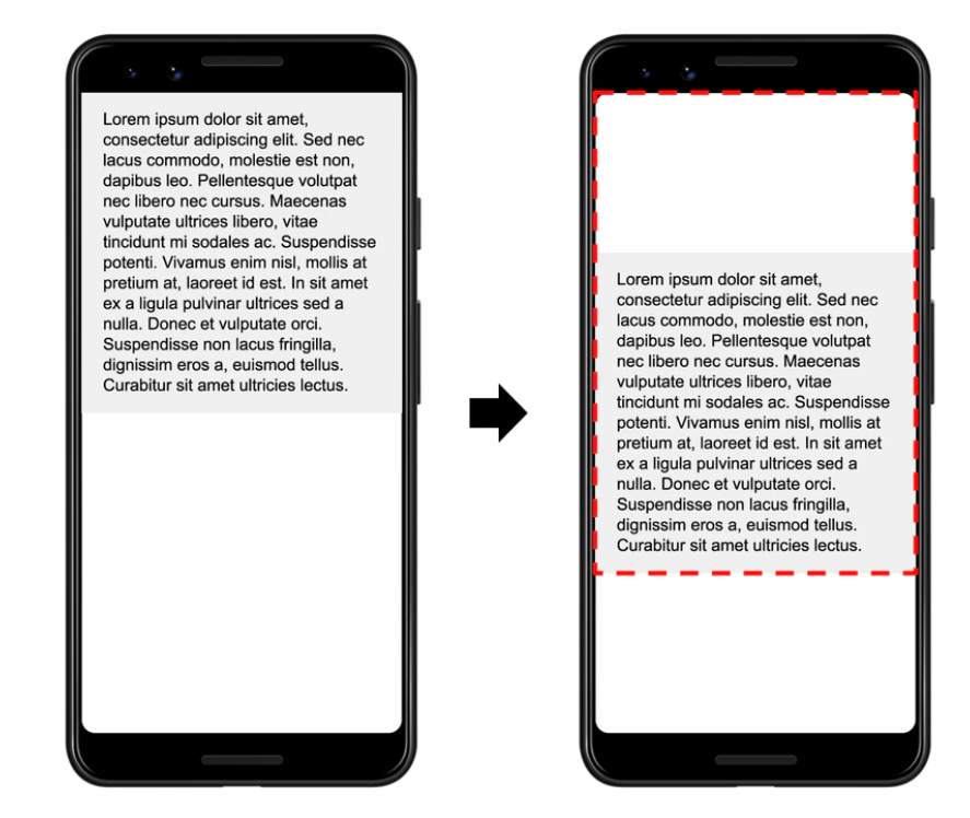 Image credit: web.dev
A low CLS ensures that the page functions properly for users and site owners should try to achieve a time measurement of less than 0.1 seconds.
As mentioned before, aside from the main Core Web Vitals, there are diagnostic metrics included in the dashboard. One such metric is the First Contentful Paint or FCP. The FCP metric measures the time it takes from when the page starts to load to when any part of the page’s content appears on the screen. With this metric, content is considered to be an image, text or any other non-white element. This is a useful metric to monitor along with Core Web Vitals as it is the first element a user will see on your site and know if it is working.
User demographics are also a part of the report, however, these measurements are not necessarily related to site performance but rather demonstrates the distribution of user experiences across devices and connections to accompany the rest of the data.
The three Core Web Vitals essentially measures the main elements of site performance in order to improve user experience. Since Google wants to be your directory to the internet it makes sense that they want to emphasise these metrics over others, in order to recommend pages that will provide a satisfying experience for users when browsing the web.
Therefore each of the Core Web Vitals are related to user experience in some way. LCP relates to page speed and how quickly the site loads for the user to be able to view it.
FID relates to interactivity for the user, how quickly can the page respond to their interaction. CLS is to do with how visually stable the content on the page is for the user to view, interact and easily enjoy.
Monitoring and in turn optimising for Core Web Vitals will help improve site performance, thereby also providing a better experience for users when browsing the web. This will not only decrease bounce rates but also increase the ranking of those pages since site performance is becoming more of a ranking factor.
Image credit: web.dev
A low CLS ensures that the page functions properly for users and site owners should try to achieve a time measurement of less than 0.1 seconds.
As mentioned before, aside from the main Core Web Vitals, there are diagnostic metrics included in the dashboard. One such metric is the First Contentful Paint or FCP. The FCP metric measures the time it takes from when the page starts to load to when any part of the page’s content appears on the screen. With this metric, content is considered to be an image, text or any other non-white element. This is a useful metric to monitor along with Core Web Vitals as it is the first element a user will see on your site and know if it is working.
User demographics are also a part of the report, however, these measurements are not necessarily related to site performance but rather demonstrates the distribution of user experiences across devices and connections to accompany the rest of the data.
The three Core Web Vitals essentially measures the main elements of site performance in order to improve user experience. Since Google wants to be your directory to the internet it makes sense that they want to emphasise these metrics over others, in order to recommend pages that will provide a satisfying experience for users when browsing the web.
Therefore each of the Core Web Vitals are related to user experience in some way. LCP relates to page speed and how quickly the site loads for the user to be able to view it.
FID relates to interactivity for the user, how quickly can the page respond to their interaction. CLS is to do with how visually stable the content on the page is for the user to view, interact and easily enjoy.
Monitoring and in turn optimising for Core Web Vitals will help improve site performance, thereby also providing a better experience for users when browsing the web. This will not only decrease bounce rates but also increase the ranking of those pages since site performance is becoming more of a ranking factor.
 Image credit: web.dev
Since the CrUX dashboard uses field data over lab data it is a much better indication of how a website is experienced by users. This is also why the CrUX dashboard should be a more sought-after option when analysing Core Web Vitals.
Image credit: web.dev
Since the CrUX dashboard uses field data over lab data it is a much better indication of how a website is experienced by users. This is also why the CrUX dashboard should be a more sought-after option when analysing Core Web Vitals.
 The second section is individual pages dedicated to each Web Vital, showing a historical overview by month, of your site’s performance against each metric.
 Finally, the last section includes two pages on user demographics, one on device distribution and the other on connection distribution.
 You will notice immediately that each metric is segmented into “Good”, “Needs Improvement” and “Poor” percentage scores, which are colour-coded with traffic light colours of green, yellow and red.
These different scores show the distribution of positive or negative user experiences, against each metric, for a particular month.
This makes it very easy to understand how your site is performing. You will be able to clearly identify if your site is doing well against a particular metric, or poorly and start to highlight issues that need to be fixed in order to improve your score.
When you move onto pages dedicated to individual metrics you will see how your site performs against these metrics, not just for the most recent month but also for previous months as well, providing you with a historical overview of how your site has performed.
You will also notice that the most recent month’s Good and Poor scores are represented as scorecards at the top of the page along with the percentage difference from the previous month.
This will help you to highlight where your site started to decline and investigate the reasons behind this depreciation. The opposite could also be true. You can observe an increase and match it with the impact of your recommendations, all down to a very clear representation of your site’s data over time.
It is this in-depth breakdown of data dedicated to each metric, over months of data collection and clear illustration of the most essential KPIs that separates the CrUX dashboard from other tools available such as Google PageSpeed Insights.
With Google PageSpeed Insights, only data from the most recent daily aggregation of 28 days is returned. When compared to the CrUX dashboard, this is vastly limited data that is returned for an origin. Being able to see the site performance data for previous months greatly allows us to gain better insights and make much more informed recommendations.
You will notice immediately that each metric is segmented into “Good”, “Needs Improvement” and “Poor” percentage scores, which are colour-coded with traffic light colours of green, yellow and red.
These different scores show the distribution of positive or negative user experiences, against each metric, for a particular month.
This makes it very easy to understand how your site is performing. You will be able to clearly identify if your site is doing well against a particular metric, or poorly and start to highlight issues that need to be fixed in order to improve your score.
When you move onto pages dedicated to individual metrics you will see how your site performs against these metrics, not just for the most recent month but also for previous months as well, providing you with a historical overview of how your site has performed.
You will also notice that the most recent month’s Good and Poor scores are represented as scorecards at the top of the page along with the percentage difference from the previous month.
This will help you to highlight where your site started to decline and investigate the reasons behind this depreciation. The opposite could also be true. You can observe an increase and match it with the impact of your recommendations, all down to a very clear representation of your site’s data over time.
It is this in-depth breakdown of data dedicated to each metric, over months of data collection and clear illustration of the most essential KPIs that separates the CrUX dashboard from other tools available such as Google PageSpeed Insights.
With Google PageSpeed Insights, only data from the most recent daily aggregation of 28 days is returned. When compared to the CrUX dashboard, this is vastly limited data that is returned for an origin. Being able to see the site performance data for previous months greatly allows us to gain better insights and make much more informed recommendations.
 Once the origin is successfully recognised and you select the “Create Report” option on the schema page, you will then be taken to the dashboard itself, and that’s it. That’s all there is to it.
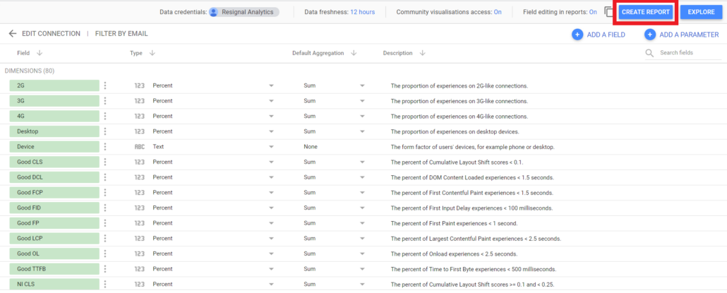 The Community Connectors feature has done all of the hard work for you, so a fully complete, auto-generated dashboard populated with charts that breaks down the performance of your site against the Core Web Vitals is ready for use.
Since the CrUX dashboard is so easy to create, requiring no prerequisite SQL knowledge, access to BigQuery or even familiarity with Data Studio itself, anyone in your team, from a new junior analyst, to more senior managers, regardless of their experience with Google Data Studio can create the dashboard, get quickly comfortable with its clear user interface and start to monitor and discern actionable insights on a client’s trending site performance. This is not just true of colleagues but of clients as well. They will also find it easy to access the dashboard and align with your recommendations.
The Community Connectors feature has done all of the hard work for you, so a fully complete, auto-generated dashboard populated with charts that breaks down the performance of your site against the Core Web Vitals is ready for use.
Since the CrUX dashboard is so easy to create, requiring no prerequisite SQL knowledge, access to BigQuery or even familiarity with Data Studio itself, anyone in your team, from a new junior analyst, to more senior managers, regardless of their experience with Google Data Studio can create the dashboard, get quickly comfortable with its clear user interface and start to monitor and discern actionable insights on a client’s trending site performance. This is not just true of colleagues but of clients as well. They will also find it easy to access the dashboard and align with your recommendations.

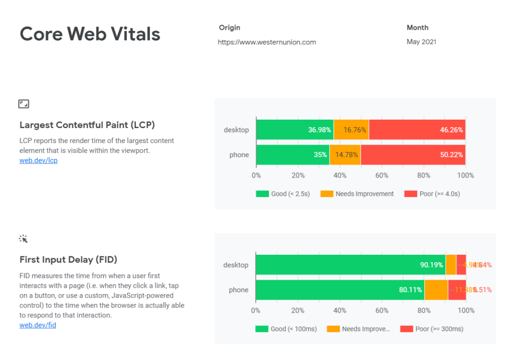

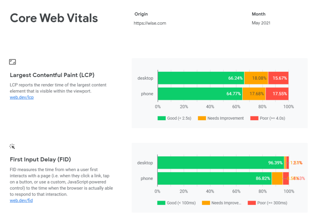


Image credit: web.dev
This public data set of real user experiences can be accessed through tools that you might already be familiar with, such as Google’s PageSpeed Insights which uses both field data and lab data to report on Core Web Vitals at both an origin and individual page level, for the most recent aggregation of 28 days.
You can also connect to the CrUX dataset through BigQuery itself, giving you access to the raw data that is stored online and create your own custom reports. This however would require an understanding of SQL, which not all SEOs have.
Finally, there is the CrUX dashboard, which you may not be as aware of, which is a dashboard visualised in Google Data Studio. While both Google PageSpeed Insights and BigQuery have their advantages for reporting on Core Web Vitals, the CrUX dashboard stands out from the rest for a range of benefits including its ease of set up, use. the clarity in which it presents the breakdown of data and the inclusion of additional diagnostic metrics as well as user demographics.
But, most importantly, the historical data it possesses month over month allows for us to track and determine how our data is trending, and the impact of our SEO recommendations.
It’s for these reasons the CrUX dashboard should be an indispensable asset to every SEOs toolkit and a welcomed addition to your client reporting.
Here is a breakdown of the CrUX dashboard and some of the benefits it provides.
Core Web Vitals Explained
Before going any further, it is worthwhile briefly defining the metrics that can be reported on in the CrUX dashboard. These include most importantly the Core Web Vitals, but there are also other diagnostic metrics, which will be touched upon, as well as the two user demographic dimensions, device distribution and connectivity distribution. First, we have the Largest Contentful Paint Core Web Vital, or LCP. This metric reports on the time it takes for a page’s main content, which is typically the largest image or text block of a page, to become visible to a user. Ideally, the measurement for LCP to provide a good user experience is 2.5 seconds or less.
Image credit: gtmetrix.com
Second is the First Input Delay Core Web Vital, or FID. This web vital measures the time between when a user interacts with your site, to the time the page is able to respond to that interaction. Examples of this can include when a user simply clicks on a link or a button. The optimum measurement for FID is less than 100 milliseconds to achieve a good experience.
Finally, the last Core Web Vital is the Cumulative Layout Shift, or CLS. This metric measures how often a user experiences an unexpected change or movement in the visual layout of a page. An example of this can be when a user is about to click on a link and suddenly the link moves out of place, or if you are reading an article, the text might unexpectedly shift to a different direction.
Image credit: web.dev
A low CLS ensures that the page functions properly for users and site owners should try to achieve a time measurement of less than 0.1 seconds.
As mentioned before, aside from the main Core Web Vitals, there are diagnostic metrics included in the dashboard. One such metric is the First Contentful Paint or FCP. The FCP metric measures the time it takes from when the page starts to load to when any part of the page’s content appears on the screen. With this metric, content is considered to be an image, text or any other non-white element. This is a useful metric to monitor along with Core Web Vitals as it is the first element a user will see on your site and know if it is working.
User demographics are also a part of the report, however, these measurements are not necessarily related to site performance but rather demonstrates the distribution of user experiences across devices and connections to accompany the rest of the data.
The three Core Web Vitals essentially measures the main elements of site performance in order to improve user experience. Since Google wants to be your directory to the internet it makes sense that they want to emphasise these metrics over others, in order to recommend pages that will provide a satisfying experience for users when browsing the web.
Therefore each of the Core Web Vitals are related to user experience in some way. LCP relates to page speed and how quickly the site loads for the user to be able to view it.
FID relates to interactivity for the user, how quickly can the page respond to their interaction. CLS is to do with how visually stable the content on the page is for the user to view, interact and easily enjoy.
Monitoring and in turn optimising for Core Web Vitals will help improve site performance, thereby also providing a better experience for users when browsing the web. This will not only decrease bounce rates but also increase the ranking of those pages since site performance is becoming more of a ranking factor.
Field Data vs Lab Data
This increased attention to user experience is why the use of field data by the CrUX dashboard is so significant and is also one of the key benefits of the tool when reporting on Core Web Vitals and site performance as a whole. As discussed before the analysis and breakdown of the Core Web Vitals data is taken from real user experiences. These users have opted-in to having their browsing history synced, they have not set up a sync passphrase and they have usage statistic reporting enabled. The benefit of field data is you are collecting data on how actual, “real” users, such as you and I, are experiencing the performance of a site. This means that data on actual page load times on different devices, with varying good or poor connection types, across the world, is collected. Lab data, on the other hand, is the data that is collected in a controlled environment, on a well-functioning computer with good internet access. So it’s an approximation of the site’s page speed under ideal conditions. It’s a synthetic representation of how your site would perform in the field.
Image credit: web.dev
Since the CrUX dashboard uses field data over lab data it is a much better indication of how a website is experienced by users. This is also why the CrUX dashboard should be a more sought-after option when analysing Core Web Vitals.
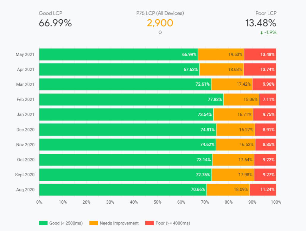
Historical Data
Now that we have established what the CrUX dashboard is, what the Core Web Vitals are and how field data is more effective at reporting on these metrics than lab data, let’s now move on to one of the dashboard’s distinguishing benefits, which is how easy it is to understand, navigate but most importantly the access to historical data for each metric. The dashboard itself can be separated into three main sections. The first is an overview of each of the Core Web Vitals for the most recent month. This constitutes the first page of the dashboard.
The second section is individual pages dedicated to each Web Vital, showing a historical overview by month, of your site’s performance against each metric.
Finally, the last section includes two pages on user demographics, one on device distribution and the other on connection distribution.
You will notice immediately that each metric is segmented into “Good”, “Needs Improvement” and “Poor” percentage scores, which are colour-coded with traffic light colours of green, yellow and red.
These different scores show the distribution of positive or negative user experiences, against each metric, for a particular month.
This makes it very easy to understand how your site is performing. You will be able to clearly identify if your site is doing well against a particular metric, or poorly and start to highlight issues that need to be fixed in order to improve your score.
When you move onto pages dedicated to individual metrics you will see how your site performs against these metrics, not just for the most recent month but also for previous months as well, providing you with a historical overview of how your site has performed.
You will also notice that the most recent month’s Good and Poor scores are represented as scorecards at the top of the page along with the percentage difference from the previous month.
This will help you to highlight where your site started to decline and investigate the reasons behind this depreciation. The opposite could also be true. You can observe an increase and match it with the impact of your recommendations, all down to a very clear representation of your site’s data over time.
It is this in-depth breakdown of data dedicated to each metric, over months of data collection and clear illustration of the most essential KPIs that separates the CrUX dashboard from other tools available such as Google PageSpeed Insights.
With Google PageSpeed Insights, only data from the most recent daily aggregation of 28 days is returned. When compared to the CrUX dashboard, this is vastly limited data that is returned for an origin. Being able to see the site performance data for previous months greatly allows us to gain better insights and make much more informed recommendations.
How to Set Up the Crux Dashboard
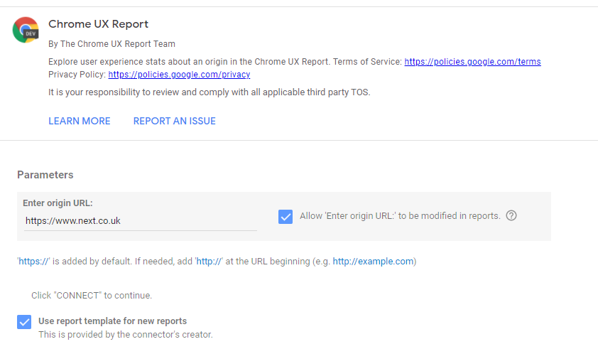
In addition to how easy the CrUX dashboard is to understand, navigate and pull historical data from, it is also just as easy to create. With all the talk earlier on the CrUX data being stored online in BigQuery, retrieving the data through SQL queries, then the distributions of “Good”, “Needs Improvement” and “Poor” scores across various types of metrics, and visualised in different charts, month over month, you may be wondering how difficult it might be to create the CrUX dashboard. You might also be thinking that you need to be a Data Studio wizard to visualise all of that data into clear and easily understandable charts. But good news, that’s not the case. Thanks to a simple feature within Data Studio called Community Connectors, building the CrUX dashboard is easier than you think. This is where the ease of setup becomes most evident. This Community Connectors feature links Data Studio with the CrUX data set in BigQuery, removing any of the hard work you might have anticipated from writing SQL queries to retrieve the necessary data. All of the visuals and pages within the dashboard are automatically generated, also doing away with the time spent on manual design efforts. You can start creating the dashboard by simply following this link and adding the origin, which you want the dashboard to be based on. Make sure what you enter is an original and not a full URL as URLs are not supported.
Once the origin is successfully recognised and you select the “Create Report” option on the schema page, you will then be taken to the dashboard itself, and that’s it. That’s all there is to it.
The Community Connectors feature has done all of the hard work for you, so a fully complete, auto-generated dashboard populated with charts that breaks down the performance of your site against the Core Web Vitals is ready for use.
Since the CrUX dashboard is so easy to create, requiring no prerequisite SQL knowledge, access to BigQuery or even familiarity with Data Studio itself, anyone in your team, from a new junior analyst, to more senior managers, regardless of their experience with Google Data Studio can create the dashboard, get quickly comfortable with its clear user interface and start to monitor and discern actionable insights on a client’s trending site performance. This is not just true of colleagues but of clients as well. They will also find it easy to access the dashboard and align with your recommendations.
Diagnostic Metrics
Other such key advantages of the CrUX dashboard include, as highlighted earlier, the analysis of not just the Core Web Vitals but also on other diagnostic metrics as well. The dashboard provides the same degree of analysis for the three Web Vitals as it does for diagnostic metrics. These metrics can also be important to take note of when reporting on site performance and the breakdown of historical data will prove to be just as useful in determining this. The inclusion and breakdown of data for metrics like First Contentful Paint and Time to First Byte are exclusive to the CrUX dashboard and are not as readily available from other tools on the market.
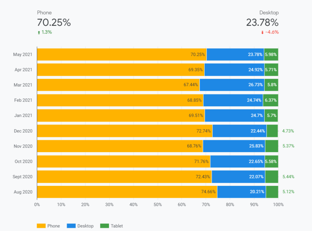
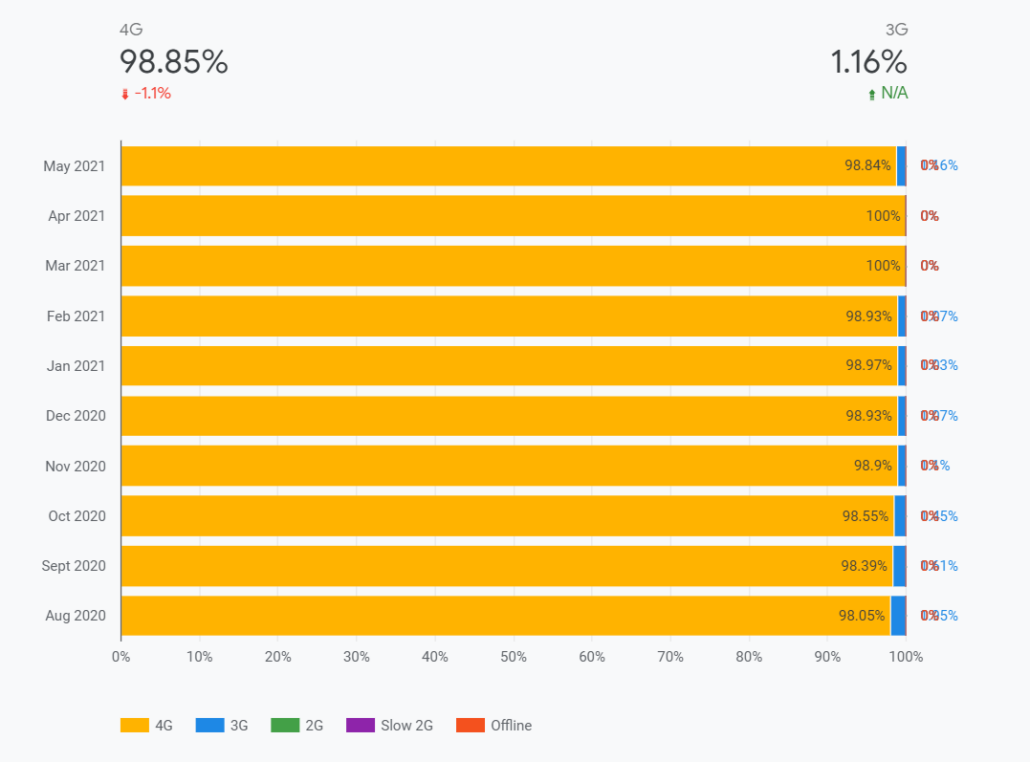
User Demographics
Just like how diagnostic metrics are included in the dashboard so too are user demographic dimensions. The dashboard also provides data on two dimensions related to user demographics, which are device distribution and connection distribution. In a similar manner to the way, the data for Core Web Vitals and diagnostic metrics are broken down into their three individual scores, month over month, for the device distribution page they are segmented based on phone, tablet and desktop device users. This is the same for the connection distribution page, where you will get a breakdown of the various connection types users are accessing your site with, from 4G to Slow 2G and even Offline. Here you will be able to determine what connection types are most used by your users, which in turn might guide you on how optimise your site for the more popular network connections you identify. While this data might be available in other tools such as Google Analytics, it is again the clear visual design and interface that can make it easier for other members of the team as well your clients to identify trends and important insights, who are not so familiar with Google Analytics’ functionality.Reporting on Competitors
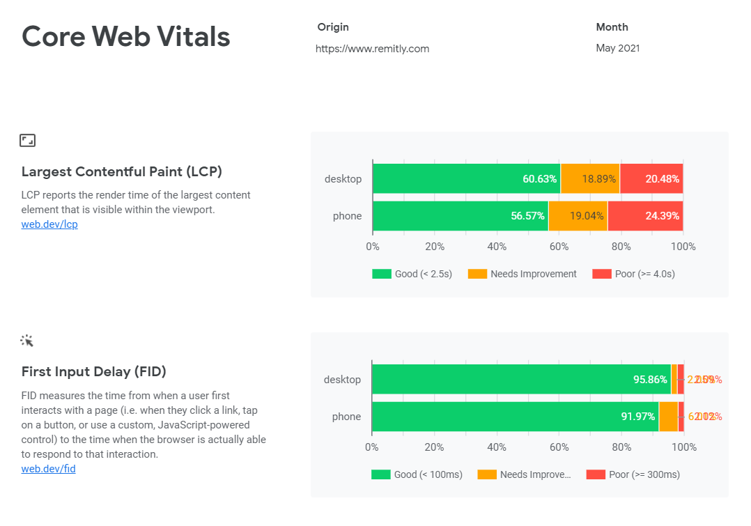
Finally, one of the most significant perks that the CrUX dashboard offers is that we are not limited to reporting on our own or client’s site, but we can also report on our competitors in the same robust manner. You could even potentially examine an entire vertical of the web to contrast site performance across a range of examples. Creating CrUX dashboards on your competitors would give you the same insights month over month as to how they perform against Core Web Vitals. The data refreshes every month, so you will always have new, continuous data that you can compare against. For example, for a client in the finance vertical, we can report on their potential competitors, like Western Union, Wise and Remitly.Western Union
Wise
Remitly